Emotewell - Check Your Progress in Journaling
The all-in-one journaling product to find prompts to express your feelings.
Overview
Emotewell is a mental health journaling platform targeted to make mental self-care easier and more effective. It provides personalized science-backed prompts to what type of mental health issues you need help with.
Me and 2 other UX Designers were brought in to build the mobile version of Emotewell using the Google Design Sprint for rapid prototyping and testing features with target users. Our focus for this design sprint is to reiterate the journaling flow and profile to show history of journals, mood stats, and journaling progress stats.
My Role
Lead UX/UI Designer (UX Research, UI Design, Usability Testing)
Teammates
Sofia, Ewuaredjoa, Chloe, and Sarah
Tools
Design Tools (Figma, FigJam)
Collaboration Tools (Slack, Google Drive)
Scope
August 2024 (2-week Design Sprint)
Revisiting the Feedback from Previous Design Sprints
We looked back at the Usability Testing from the last Design Sprint and found that most of the features that were reiterated: the habit tracker and award screen were effective and clear to the users.
However, when it comes to main feature of the product, testers felt that:
The visual design is not appealing to them.
The navigation though certain features like stats and journaling felt confusing.
Sprint Goal and HMW Questions
From our findings from Usability Testing, we knew that for this design sprint we needed to ask ourselves:
1. How might we help users feel a sense of progress and achievement while using the platform?
2. How might we simplify the navigation of the product with its features?
Our long-term goal is to make people journal regularly and manage their mental health.
Design Sprint Timeline
Lightning Demo
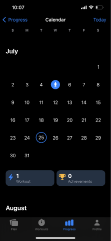
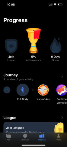
We decided to look at real world products that have great visualization of progress throughout their app. Seven was one product that excellently showed the progress of workouts throughout the app. It had a gamification system where customers can receive achievements from using the app.
Progress - Stats
Progress - Calendar
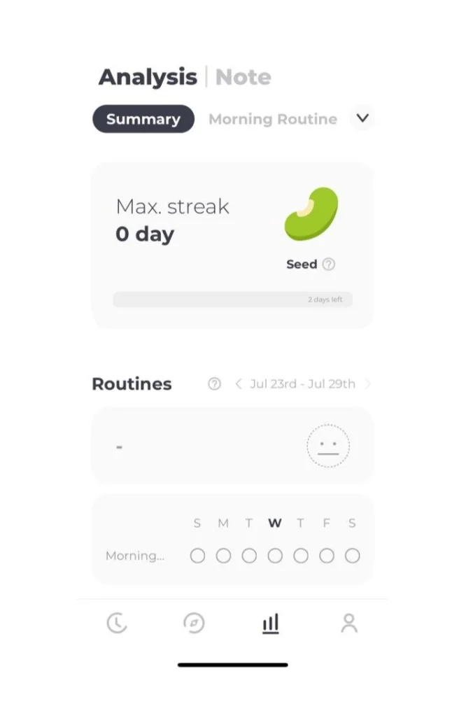
CareU (Routine Planner)
Progress - Achievements
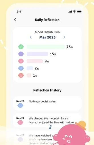
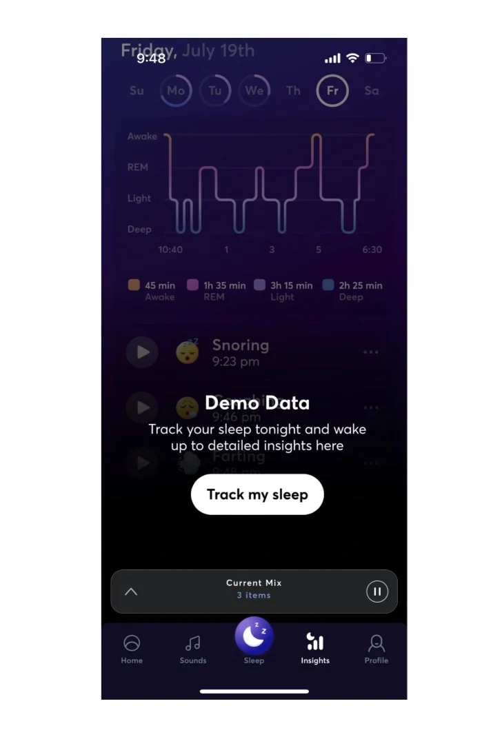
We also took a look at other apps that showed great visualization of progress like mood tracker, calendar, monthly stat graphs.
BetterMe (Sleep Tracker)
Routinery (Self Care App)
Solution
Looking through all the lightning demos, we began sketching solutions on how to solve the sprint questions. A problem we came across is how we can make accessible to look at the progress of achievements, stats, and history.
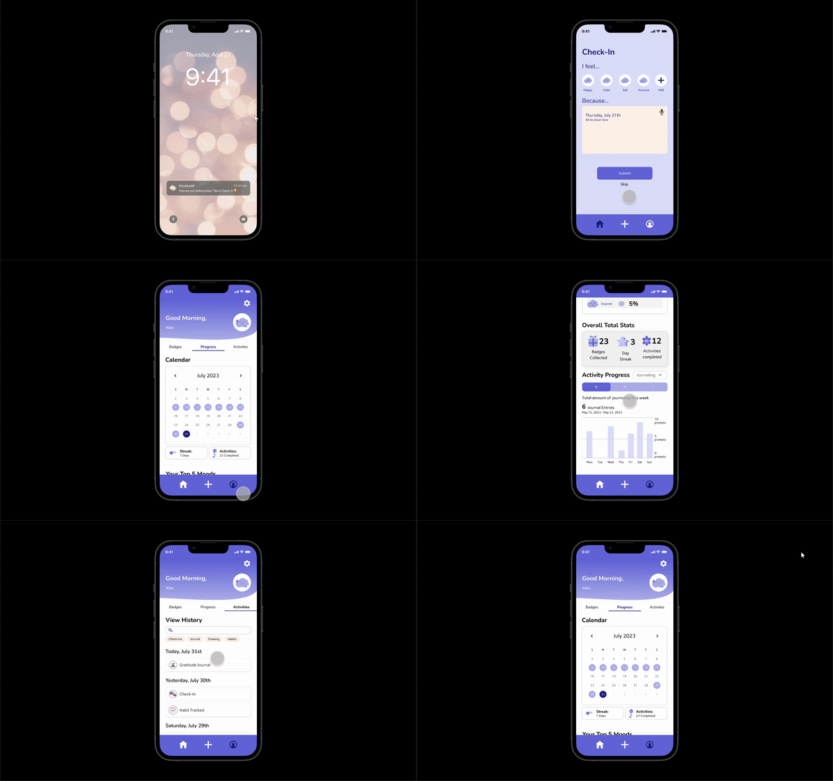
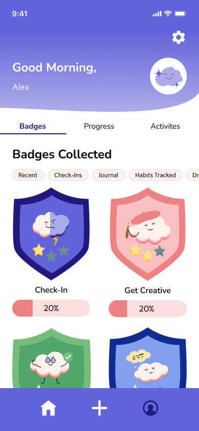
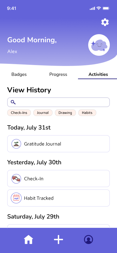
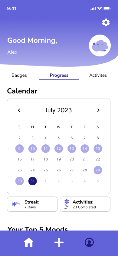
One solution was to add badges, stats, and calendar section into the profile screen, separated by tabs. Stats shows top 5 mood chart, calendar, and history of activities completed in the app.
High Fidelity Wireframe
Badges section included badges pertaining to an activity completed
Progress section included calendar and graphs tracking moods and activity completion
History of activities completed throughout the app.
Prototype
Usability Testing
Most of the testers liked the stats on the homepage and found easy to navigate through each section. However, they found themselves confused with other features:
Journaling prompts felt a bit redundant.
More customization of colors
Stars in badges confused the testers as they felt they can use them to unlock a prize.
We were able to create a visual appealing profile that users can navigate stats and progress through the product.
Future of Emotewell
This design sprint proved to show that there are few things that need to be learned:
The importance of creating visually appealing graphs to help view progress throughout the apps.
Understand if the flow through each screen makes sense and not confusing to navigate.
The next step for Emotewell is to flesh out the flow of journaling in different formats and converting the mobile app wireframes designs to the existing website for consistency.
